...since when did they switch to right-hand drive?
(Yes, I did get my terminology straight.)
...since when did they switch to right-hand drive?
(Yes, I did get my terminology straight.)
Over the past few weeks I've been getting progressively worse connection quality from Google Mail (GMail). Then, as of yesterday morning, about 24 hours ago, it stopped working entirely, giving me a 502 error.
Now, this isn't the first time GMail has gone AWOL. About two years ago, I had GMail disappear for one day, then two, then three...and then it came back for a few hours, then disappeared again for about three more days, for a total of nearly a week. I even wrote to some high-ups I know at Google, but to no avail.
But those were presumably growing pains. This one is a bit harder to take. Especially when the error message says to try again in 30 seconds, but their support site says it's expected to be out until about 6pm Pacific time today—that would be a total of eighteen hours of outage.
Maybe you're stretching a bit too thin, Google.
Did you have art classes in high school? I did. I learned a lot in them. Not art—our teacher wasn't up to the task of squeezing any productions out of me—but rather my inadequacy at it. Those experiences registered not so much as scars but as shoals, to be avoided as I went off to seek something for which I had a little talent.
Now, I had a similar experience with handwriting. (Before you ask, no, I didn't abandon that altogether, though there were certainly times when I considered it, and in the era of computing I effectively have.) I'm left-handed by nature, and hence wrote naturally with my left hand. But writing left-handed in India was considered unacceptable, so I had to take after-school lessons to learn to write dextrously. The result was that I wrote disastrously, in a scrawl that was so ill-formed it wasn't even bad enough to be considered awful.
But sometime in 9th grade, I tired of the state of affairs. I wasn't quite sure what to do about it—after all, it wasn't for lack of practice, so more of the same wasn't going to help—so on a whim I opened up an encyclopaedia to the entry on calligraphy, and worked through tracing out letter-forms. I hadn't ever used a broad-nibbed pen (and didn't have one, either), so it took me a while before I realized the pattern to where the strokes were thin and thick. But I eventually got the hang of it, to the point of being able to reproduce a passable Textualis blackletter.
Which brings us back to art. I realized this summer that I was similarly tired of my inability to draw just about anything at all. I tend to have lots of pictures in my head, and ever since I've come to understand the visual language of cartooning I've wanted to learn it. (For me, reading my morning funnies is a bit like watching the infielders in a baseball game: periodically, I see something so stunning that I focus entirely on the particular act and forget all about the context of what I'm watching.) I've tried to work through cartooning books, but I tire of messing around with paper and pencil.
The game-changer was, amazingly, a software program. My OQO 1+ came with a copy of Alias (now Adobe) Sketchbook Pro (v. 2.0.1), which I'd never used in the two years I've had the machine. One day I idly started the application, picked the felt-tip marker tool, set it down on the canvas...and saw this:

That's right, the ink spread, as if it were a real pen put to real paper.
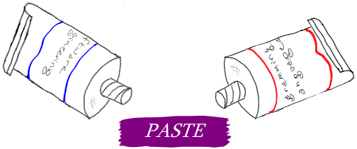
Something about that moment was magical. As I explored the application more and found out how much more it simulated the physics of paper-based media, I was hooked. I was in the process of preparing the Web site for PASTE 2008, which I co-chaired, and I was annoyed at the lack of any visual embellishment. Perhaps, I thought, I could fix that myself. So I came up with this, which you can see in context.
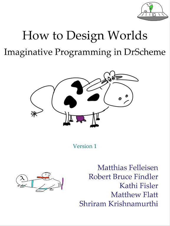
Buoyed by this success (by which I mean, I asked a few other PASTE dignitaries what they thought about it, and they gave me stiff-lipped responses to the effect that any visual embellishment is welcome—carefully saying nothing at all about this specific one), I started to design images for use in our new book-let. Now you know whom to blame for all the images in the first version of How to Design Worlds, though I am rather pleased with the cow and the UFO (both also to be found on the cover), and by the graphic accompanying “The Movie Principle” (section 4.4, page 11 in the book).
All this can only lead to hubris—and it has. Our latest victim is another wall of the same room that we painted earlier. We now have a little mountain thing going,

which includes my personal rendition of the Pão de Açúcar:

Somewhere in here is a message for my art teachers, but I'm not sure what. Perhaps just, “Don't worry, you didn't miss much”.

